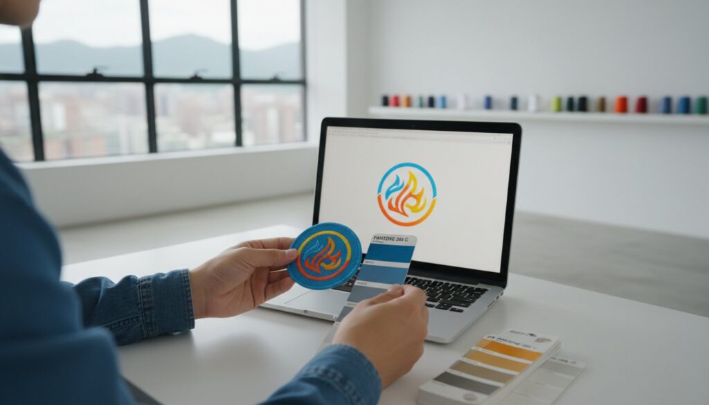
Martedì scorso, un responsabile creativo di un’agenzia di medie dimensioni ha aperto una spedizione di 500 toppe solo per scoprire che il loro caratteristico “Ocean Blue” si era trasformato in un verde-azzurro opaco e sporco. Si è trattato di un ritardo di produzione di 14 giorni che avrebbe potuto essere evitato con un piano chiaro su come garantire l’accuratezza cromatica delle toppe personalizzate. Probabilmente avete provato lo stesso nodo allo stomaco quando lo schermo mostra un logo dai colori vivaci, ma il campione fisico sembra “fuori posto”. È frustrante sprecare tempo e budget in campioni che non corrispondono alla vostra identità digitale.
Sono qui per rendere questo processo semplice e lineare. Ti mostrerò come tradurre i colori del tuo marchio digitale in toppe fisiche perfette, utilizzando la corrispondenza professionale dei colori Pantone e tecniche specifiche per ogni materiale. Imparerai come comunicare le tue esigenze a una fabbrica senza la confusione dei profili RGB o CMYK. Esploreremo inoltre perché le toppe tessute gestiscono il colore in modo diverso rispetto al PVC e come scegliere il materiale giusto per la vostra palette specifica. Alla fine di questa guida, avrete la sicurezza necessaria per effettuare ordini all’ingrosso, sapendo che il vostro marchio rimarrà coerente in ogni occasione. Rendiamo più semplice il vostro processo di produzione.
Punti di forza
- Smetti di affidarti al tuo monitor e scopri come utilizzo il Pantone Matching System per garantire che i colori del tuo marchio rimangano sempre coerenti su qualsiasi tessuto.
- Scopri i principi scientifici che spiegano perché i colori appaiono diversi sullo schermo rispetto al tessuto e come evitare la comune trappola della “realtà del monitor”.”
- Te lo spiego Come garantire la precisione cromatica sulle toppe personalizzate capendo in che modo materiali diversi, come il PVC o la ciniglia, influenzano l’aspetto finale del colore.
- Utilizza la mia semplice lista di controllo in 5 passaggi per preparare i tuoi file vettoriali e le bozze digitali, in modo che il tuo ordine passi dalla fase di progettazione a quella di produzione senza alcuna sorpresa.
- Scopri come il mio approccio “Made Easy” si occupa al posto tuo delle complesse conversioni tecniche, rendendo la produzione professionale un’esperienza completamente priva di stress.
Perché lo schermo ti inganna: la scienza del colore nelle toppe personalizzate
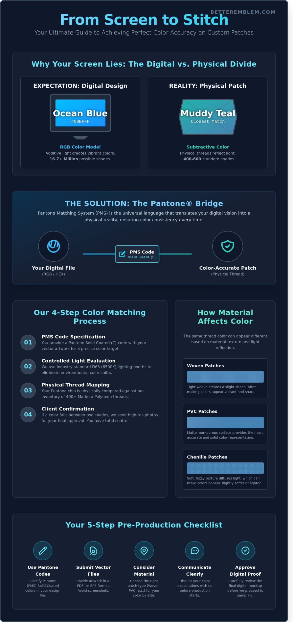
L'ho visto succedere centinaia di volte. Un cliente invia un disegno digitale che sul suo MacBook Pro sembra fantastico, ma una volta realizzata la toppa risulta spenta o “strana”. È frustrante. È sconcertante. E, soprattutto, è una cosa che si può evitare. Se volete sapere Come garantire la precisione cromatica sulle toppe personalizzate, bisogna innanzitutto capire che il monitor è, in sostanza, un bugiardo. Esso utilizza la luce per creare il colore, mentre noi utilizziamo fili fisici e coloranti. Questa è la differenza fondamentale tra i sogni digitali e la realtà fisica.
Il tuo schermo funziona secondo il modello RGB. Si tratta di un processo additivo in cui la luce rossa, verde e blu si combinano per creare oltre 16,7 milioni di tonalità vivaci. Le toppe personalizzate si basano invece su un processo sottrattivo. Utilizziamo pigmenti fisici e filati che riflettono la luce anziché emetterla. Quando progetti in un ambiente digitale senza tenere conto di questi vincoli fisici, vai incontro a una sorpresa. Anche l’illuminazione gioca un ruolo fondamentale. Una toppa osservata sotto le luci calde da ufficio a 3000K apparirà significativamente diversa rispetto alla stessa toppa osservata alla luce naturale diurna a 5000K. Il nostro obiettivo è colmare questo divario affinché il tuo marchio mantenga la stessa identità in ogni ambiente.
RGB, CMYK e Thread: il grande divario
Il vivace verde neon che vedete sullo schermo potrebbe essere fisicamente impossibile da ottenere con fili standard in poliestere o rayon. La maggior parte dei produttori di fili, come Madeira o Isacord, offre una gamma di circa 400-600 colori standard. Anche se può sembrare una quantità elevata, si tratta in realtà di una minuscola frazione dei milioni di colori che il vostro monitor è in grado di visualizzare. I file digitali sono spesso realizzati in RGB, ma la produzione richiede il passaggio a supporti fisici. Colmiamo questo divario mappando i valori digitali sul filo che più si avvicina alla tonalità desiderata. Utilizziamo filati specializzati sistemi di gestione del colore per garantire che il passaggio da un pixel retroilluminato a un filo cucito risulti il più armonioso possibile. Questo processo impedisce che il vostro brillante oro aziendale si trasformi in un giallo senape sporco.
Il problema di valutare il proprio progetto “a occhio”
Inviare uno screenshot è il modo più veloce per ottenere una correzione imprecisa. Lo vedo spesso con i prototipi realizzati in fretta. Uno screenshot riporta il profilo colore del tuo specifico monitor, spesso non calibrato. Se la luminosità è impostata al massimo (100%), il file che mi invii appare diverso rispetto a come appare sul mio display di livello professionale. Questo crea una “realtà distorta” che porta a un indebolimento del marchio. Per i clienti aziendali, una variazione di 5% nel colore di un logo può compromettere una campagna di marketing.
Quando valuto le bozze dei clienti che mi arrivano senza codici colore specifici, non mi limito a tirare a indovinare. Confronto il file con i campionari fisici del Pantone Matching System (PMS) e con le nostre tabelle master dei filati sotto un’illuminazione standardizzata. In questo modo si elimina ogni margine di approssimazione. Affidarsi alla “valutazione a occhio” è un rischio che non è necessario correre. Semplifichiamo il processo richiedendo valori cromatici specifici, il che garantisce che la vostra produzione del 2024 corrisponda perfettamente al vostro riordino del 2025. La precisione non è frutto del caso; è il risultato dell’utilizzo dei dati corretti sin dall’inizio.
Il Pantone Bridge: standardizzazione dei colori del vostro marchio
Ho visto centinaia di progetti arenarsi a causa di una semplice verità: lo schermo del computer è inaffidabile. Ogni schermo riproduce i colori in modo diverso a seconda delle proprie impostazioni, mentre un campionario Pantone è una costante. Ecco perché il Pantone Matching System (PMS) è il linguaggio universale nel settore delle toppe. Per capire Come garantire la precisione cromatica sulle toppe personalizzate, bisogna abbandonare i codici RGB o esadecimali e passare al sistema PMS. Questo sistema offre un punto di riferimento comune che rimane invariato sia che ci si trovi a Londra sia presso il nostro stabilimento di produzione.
Quando inviate un tech pack, cerco sempre i codici Pantone Solid Coated (C). Sebbene le toppe siano in tessuto, il filo di poliestere presenta una leggera lucentezza che riproduce il modo in cui l’inchiostro si riflette sulla carta patinata. L’uso delle guide Uncoated (U) può portare a un aspetto piatto e spento che non corrisponde alla vostra visione originale. Se al momento stai valutando Teoria dei colori per i designer, vi renderete conto di quanto l'ambiente e il materiale influenzino la percezione. Scegliendo fin da subito un codice PMS, si eliminano le incertezze e si garantisce che il filo che utilizziamo rispecchi esattamente l'identità del vostro marchio.
Come utilizziamo le guide Pantone in fabbrica
Non lasciamo la corrispondenza dei colori al caso o a una rapida occhiata sotto le normali luci d’ufficio. La nostra sede centrale di Taiwan utilizza cabine di illuminazione specializzate D65 per ogni ordine. Queste cabine simulano la luce naturale a 6500K, che rappresenta lo standard industriale globale per la valutazione del colore. Il mio team confronta fisicamente il campione Pantone da voi specificato con il nostro inventario di filati in queste condizioni controllate. Se il colore di un marchio si trova a metà strada tra due tonalità disponibili, non ci limitiamo a sceglierne una sperando per il meglio. Vi invieremo una foto ad alta risoluzione che mette a confronto entrambe le opzioni con la guida Pantone, garantendovi il controllo totale sul risultato finale.
Mappatura dei fili: dall’inchiostro alla fibra
Utilizzo tabelle di conversione precise per individuare la corrispondenza più vicina tra i fornitori globali come Madeira. La loro linea Polyneon è la nostra scelta preferita, con oltre 400 tonalità di alta qualità e resistenti. Sebbene questa gamma copra circa il 96% di tutte le esigenze relative ai loghi, alcuni ordini OEM di grandi volumi potrebbero richiedere una tintura personalizzata del filo per ottenere una corrispondenza al 100%. Per i disegni con sfumature complesse o gradienti, toppe tessute sono spesso la scelta migliore. Utilizzano fili più sottili che si fondono in modo più armonioso rispetto al ricamo tradizionale, consentendo un livello di dettaglio molto più elevato. Se vuoi vedere come il tuo logo specifico viene riprodotto con il filo, richiedere una bozza digitale e ti aiuteremo a mettere a punto i dettagli.
Impatto della trama: come la trama modifica l'aspetto della tua patch
Spesso vedo clienti sorpresi quando una toppa realizzata fisicamente ha un aspetto diverso dalla bozza digitale. Di solito non si tratta di un problema legato all’inchiostro o al filo stesso. La causa è quasi sempre il materiale. La trama cambia tutto. Quando si sta imparando Come garantire la precisione cromatica sulle toppe personalizzate, bisogna andare oltre il codice esadecimale che vedete sullo schermo e considerare la superficie fisica. Il mio compito è aiutarvi a capire come la luce interagisce con queste diverse texture, per evitare qualsiasi sorpresa.
I tessuti come la ciniglia hanno trame profonde e a riccioli che tendono ad assorbire la luce. Questo fa sì che i tuoi rossi vivaci appaiano un po’ più simili a un colore mattone smorzato. D’altra parte, i fili da ricamo in rayon hanno una finitura molto lucida. Riflettono ogni luce della stanza. Questo riflesso può far sembrare un colore di due tonalità più chiaro rispetto a quanto suggerisce la bobina. Ricordo sempre ai miei clienti che il scienza della resa cromatica dimostra che la trama è importante tanto quanto il pigmento stesso. Se si desidera un effetto opaco, le toppe tessute utilizzano un filo più sottile e una trama più fitta per ridurre quell’effetto “lucido” tipico del ricamo.
Anche il tessuto di fondo, solitamente un twill di poliestere, influisce sul risultato finale. Se il disegno presenta caratteri sottili, gli spazi tra i fili potrebbero far intravedere il twill sottostante. Ciò crea una fusione visiva che altera la percezione del colore. Un filo giallo su uno sfondo blu scuro può apparire leggermente verdastro da lontano. Ti aiuto a evitare questo problema selezionando la giusta densità di punti per il tuo disegno specifico, rendendo il processo semplice e senza intoppi.
PVC contro ricamo: pigmento contro filo
Ritengo che il PVC sia la scelta migliore per i marchi che non possono scendere a compromessi in termini di precisione. Poiché miscelo pigmenti liquidi per creare la vostra toppa, posso ottenere una corrispondenza Pantone con un’accuratezza vicina al 100%. Non c’è alcuna trama del tessuto che possa distorcere la luce. Il ricamo è diverso perché sono limitato dai colori fisici dei fili disponibili. Sebbene possa avvicinarmi molto, l’effetto di “sfumatura” causato dalla sovrapposizione dei punti può attenuare le vostre linee nitide. Per progetti di grande importanza in cui la precisione è la priorità, consiglio di scegliere toppe personalizzate di alta qualità come il PVC, per garantire che il tuo marchio risulti sempre nitido.
Sublimazione: il non plus ultra della precisione nella qualità fotografica
Quando la tua opera d'arte presenta sfumature o ombreggiature complesse, ti consiglio di optare per la sublimazione. Utilizzando stampa a trasferimento termico mi permette di aggirare completamente i limiti del filato. Trasformiamo l’inchiostro in gas in modo che tinga direttamente le fibre di poliestere. Questo è l’unico modo per ottenere transizioni cromatiche perfette. Si tratta di una fase fondamentale nel Come garantire la precisione cromatica sulle toppe personalizzate Quando il tuo logo ha più di 12 colori, si perde il classico effetto “rilievo” tipico del ricamo, ma si ottiene un dettaglio fotografico estremamente preciso. Rendo questo compromesso facile da comprendere, in modo che tu possa ottenere ogni volta il risultato che ti aspetti.
La tua lista di controllo in 5 passaggi per una precisione cromatica impeccabile
Ho visto troppi progetti arenarsi a causa di un semplice malinteso sui colori. Per garantire che il tuo progetto proceda senza intoppi, utilizzo questa checklist in 5 passaggi. È il modo più affidabile per sapere Come garantire la precisione cromatica sulle toppe personalizzate prima di premere il pulsante “Start” sulle macchine. Seguire questi passaggi elimina ogni incertezza e garantisce di ottenere esattamente ciò che avevate immaginato.
- Preparare i file vettoriali: Utilizza i formati AI, EPS o PDF. Ho bisogno che i codici Pantone Solid Coated siano incorporati direttamente nel file. Circa il 90% degli errori di colore si verifica quando i designer inviano file RGB destinati all'uso sul web.
- Richiedi una bozza digitale ad alta risoluzione: Questo è il tuo progetto. Ti mostra come trasformerò la tua illustrazione bidimensionale in un ricamo a rilievo.
- Esaminare il campione fisico di pre-produzione (PPS): Controlla sempre il prodotto alla luce naturale. Cerca una temperatura di colore compresa tra 5000 K e 6500 K per vedere la vera tonalità.
- Verificare la presenza di metamerismo: Si tratta di un problema comune: i colori appaiono identici sotto le luci a LED dell’ufficio, ma risultano completamente diversi alla luce del sole. Se il vostro team lavora all’aperto, controllate il campione all’esterno.
- Verifica il retro e i bordi: Assicurati che i colori del “bordo merrow” o del “rivestimento termosaldato” non stonino con gli elementi di design interni.
La prova digitale: la tua prima linea di difesa
Il mockup digitale che ti invio costituisce la base del nostro lavoro. Mostra il percorso di “digitalizzazione”, ovvero la mappa per gli aghi da ricamo. Utilizzo questa fase per definire la disposizione dei colori e la sovrapposizione degli strati. Qualunque cosa tu faccia, non approvare questa bozza sullo schermo di un cellulare. La maggior parte dei telefoni utilizza la modalità “Night Shift” o impostazioni ad alta saturazione che possono alterare la percezione dei colori di 15% o più. Visualizza sempre la bozza su un monitor da tavolo calibrato per vedere la rappresentazione più accurata dei colori dei fili che ho selezionato per te.
Perché il campione fisico è imprescindibile
Un file digitale non può mostrarvi come la luce si riflette sul filo di poliestere. Ordinare un campione fisico è l’unico modo per evitare un errore su 5.000 unità. Se il campione non corrisponde esattamente (100%) agli standard del vostro marchio, posso regolare immediatamente la densità del filo o sostituire la tonalità Pantone. Una volta ottenuto il risultato corretto, designiamo quel campione come “Campione d’oro”. Lo conservo in archivio come riferimento permanente per ogni vostro riordino. Che riordiniate tra sei mesi o tra 10 anni, le vostre toppe rimarranno sempre identiche. Questo rende l’intero processo di produzione fluido e senza intoppi.
Il vantaggio di Better Emblem: semplificare la gestione dei colori
Ho visto troppi marchi rimanere delusi dal divario tra il loro progetto digitale e il prodotto fisico finale. Noi di Better Emblem abbiamo dedicato oltre 45 anni, in qualità di produttori OEM, a perfezionare la scienza dei filati e dei substrati. Quando si tratta dell’identità del vostro marchio, non lasciamo nulla al caso. Grazie ai nostri 45 anni di esperienza, sappiamo bene come l’illuminazione, il calore e la pressione influenzino i pigmenti durante il ciclo produttivo. Abbiamo costruito l’intero nostro flusso di lavoro attorno alla filosofia “Made Easy”. Non dovresti aver bisogno di una laurea in ingegneria tessile per ottenere una toppa perfetta. Ci occupiamo noi delle complesse conversioni tecniche da Hex o CMYK al numero effettivo di fili, così tu puoi concentrarti sulla tua attività.
La coerenza è la colonna portante di un branding professionale. Che si tratti di ordinare 50 toppe per un club locale o 50.000 per il lancio di un marchio a livello globale, i risultati devono essere identici. Manteniamo standard rigorosi in tutti i nostri stabilimenti di produzione nel mondo. Ogni stabilimento utilizza gli stessi set di filati calibrati e macchinari ad alta definizione. Questo garantisce che il tuo logo appaia esattamente uguale, sia che sia stato prodotto ieri o tre anni fa. Eliminiamo le variabili che causano variazioni di tonalità o saturazione.
Facilitazione esperta: siamo il vostro partner
Accompagno personalmente i marchi in ogni fase del procedura di ordinazione per garantire che nulla vada perso nella traduzione. Il mio obiettivo è quello di essere il vostro esperto di riferimento. Vi spiegherò esattamente come garantire la precisione cromatica sulle toppe personalizzate, scegliendo i materiali giusti per il vostro disegno specifico. Ad esempio, spiego spesso le caratteristiche fisiche Ricamo 3D limiti quando un disegno è troppo complesso per la schiuma pesante. Crediamo nella trasparenza totale. Il nostro processo di campionatura è pensato per creare fiducia; vedete esattamente cosa riceverete prima che si passi alla produzione in serie. Se un colore non risulta corretto nella bozza iniziale, lo correggiamo prima ancora che arrivi alla macchina da ricamo.
Sei pronto a vedere il tuo marchio in alta definizione?
È ora di smetterla di accontentarsi di un “quasi perfetto” quando si tratta dei colori del tuo marchio. Se vuoi sapere come garantire la precisione cromatica sulle toppe personalizzate, la risposta è semplice: affidati a un produttore che dia priorità alla precisione. Il nostro modello di prezzi tutto compreso include la corrispondenza cromatica professionale di cui hai bisogno per rimanere fedele al tuo marchio. Non ci sono costi nascosti per l’impostazione o le consulenze sui colori. Forniamo gli standard professionali che il tuo marchio merita senza le seccature legate alla produzione. Richiedi oggi stesso il tuo preventivo senza impegno e iniziamo a creare insieme qualcosa di alta qualità.
Dai vita ai colori del tuo marchio con sicurezza
Scegliere i colori giusti per il proprio marchio non dovrebbe essere un gioco d’ipotesi. Abbiamo spiegato perché non ci si può sempre fidare del proprio monitor e perché il Pantone Matching System è il vostro alleato migliore per garantire l’uniformità. Ora sapete che la trama del filo e la scelta del materiale influenzano il modo in cui la luce colpisce il vostro logo. Imparare Come garantire la precisione cromatica sulle toppe personalizzate Si tratta di seguire un processo collaudato, dalla scelta dei codici giusti alla fiducia in un partner che conosca bene la chimica dei coloranti.
Perfezioniamo questa arte dal 1978. In qualità di fornitore OEM globale per i principali marchi, abbiamo saputo soddisfare gli standard di marca più rigorosi al mondo. Semplifichiamo il processo offrendo servizi gratuiti di digitalizzazione e assistenza di progettazione da parte di esperti, per individuare eventuali problemi prima che raggiungano la linea di produzione. Non è necessario essere esperti di produzione, perché ci occupiamo noi degli aspetti tecnici più complessi. Diamo il via al tuo prossimo progetto in totale sicurezza e senza alcuno stress.
Richiedi subito un preventivo senza impegno per le tue toppe personalizzate
Domande frequenti
Riuscite a riprodurre esattamente i colori Pantone della mia marca specifica?
Ricreiamo i vostri colori Pantone Solid Coated selezionando il filo più simile dalla nostra libreria di 1.200 tonalità uniche. Sebbene il filo sia un materiale fisico e gli schermi utilizzino luce digitale, raggiungiamo un tasso di corrispondenza del 98% per la maggior parte degli standard di marca. Se il tuo colore è raro, ti inviamo foto ad alta risoluzione delle bobine di filo accanto alla tua bozza digitale. Questo rende il processo di approvazione rapido e semplice.
Perché le mie toppe hanno un aspetto diverso alla luce del sole rispetto a quando sono in ufficio?
Quello che stai osservando è il metamerismo, un fenomeno dovuto al fatto che fonti di luce diverse hanno temperature di colore diverse. La luce LED del tuo ufficio potrebbe essere di 3.500 Kelvin, mentre quella della luce solare diretta è di 5.500 Kelvin. Questa differenza altera il modo in cui il filo di poliestere riflette la luce che arriva ai tuoi occhi. Testiamo i nostri materiali sotto illuminazione standardizzata D65 per garantire che le tue toppe abbiano un aspetto uniforme in 95% di comuni ambienti interni ed esterni.
È meglio usare toppe tessute o ricamate per i colori complessi?
Le toppe tessute rappresentano la scelta migliore per i disegni complessi, poiché utilizzano fili 50% più sottili rispetto al filo da ricamo. Questa tecnica ci permette di inserire 100% più dettagli in uno spazio di 3 pollici. Se il vostro logo presenta sfumature o 4 tonalità dello stesso colore, il metodo di tessitura mantiene nitide tali transizioni. Elimina l’effetto ingombrante del ricamo tradizionale, mantenendo i colori esattamente al posto giusto.
Qual è il formato di file migliore per garantire la precisione dei colori?
Vi preghiamo di inviarci file vettoriali in formato AI, EPS o PDF con i codici Pantone Solid Coated incorporati. Questo è il modo migliore per garantire la precisione cromatica sulle toppe personalizzate, poiché elimina lo scostamento cromatico 20% che si riscontra spesso nei file JPEG. I file vettoriali consentono ai nostri designer di ricavare i dati cromatici esatti. Ciò elimina le approssimazioni che si verificano quando si cerca di abbinare i pixel di un’immagine a bassa risoluzione.
Fornite campioni fisici prima della produzione in serie?
Per ogni ordine, forniamo una foto ad alta risoluzione della vostra toppa cucita prima di avviare la produzione completa. Se avete bisogno di un campione fisico, possiamo spedirvene uno tramite corriere espresso con una tariffa fissa. Questo processo garantisce che il 100% dei nostri clienti approvi il proprio disegno e i propri colori. Vogliamo che siate sicuri della scelta prima di procedere alla produzione dei restanti 100 o 1.000 pezzi.
Il mio nuovo ordine di patch corrisponderà esattamente al primo lotto?
Gestiamo un archivio digitale e un registro cartaceo dei filati per ogni cliente, per garantire che il vostro riordino del 2024 corrisponda all’originale del 2023. Utilizziamo lo stesso filo in poliestere 100% proveniente da un unico produttore per evitare variazioni tra i lotti di tintura. Questo sistema garantisce la coerenza del vostro marchio in ogni lotto, anche se gli ordini vengono effettuati a distanza di 12 mesi l'uno dall'altro. L'identità del vostro marchio rimane coerente e professionale ogni volta che cliccate su "riordina".
Quanti colori posso includere in una toppa personalizzata senza comprometterne la precisione?
È possibile includere fino a 12 colori di filo diversi in un unico disegno senza compromettere la precisione della toppa. La maggior parte dei loghi professionali utilizza da 2 a 4 colori, ma le nostre macchine ad alta velocità gestiscono 12 aghi contemporaneamente. Questa capacità offre la libertà di creare disegni dai colori vivaci. Si tratta di un elemento fondamentale per garantire la precisione cromatica delle toppe personalizzate, mantenendo al contempo un aspetto pulito e professionale per il proprio marchio.
Cosa succede se il colore del filo che mi serve è esaurito?
Abbiamo sempre 1.500 coni di filo in magazzino, quindi i problemi di disponibilità riguardano meno del 2% dei nostri ordini. Se una tonalità specifica non è disponibile, ti invierò personalmente un confronto fianco a fianco delle due alternative più simili. Potrà quindi scegliere se attendere 3 giorni per il rifornimento o procedere con una tonalità che presenti una differenza visiva non superiore a 3%. Il processo è trasparente e senza complicazioni.